Cincinnati Vacant and Underutilized Parcel Priority Screen
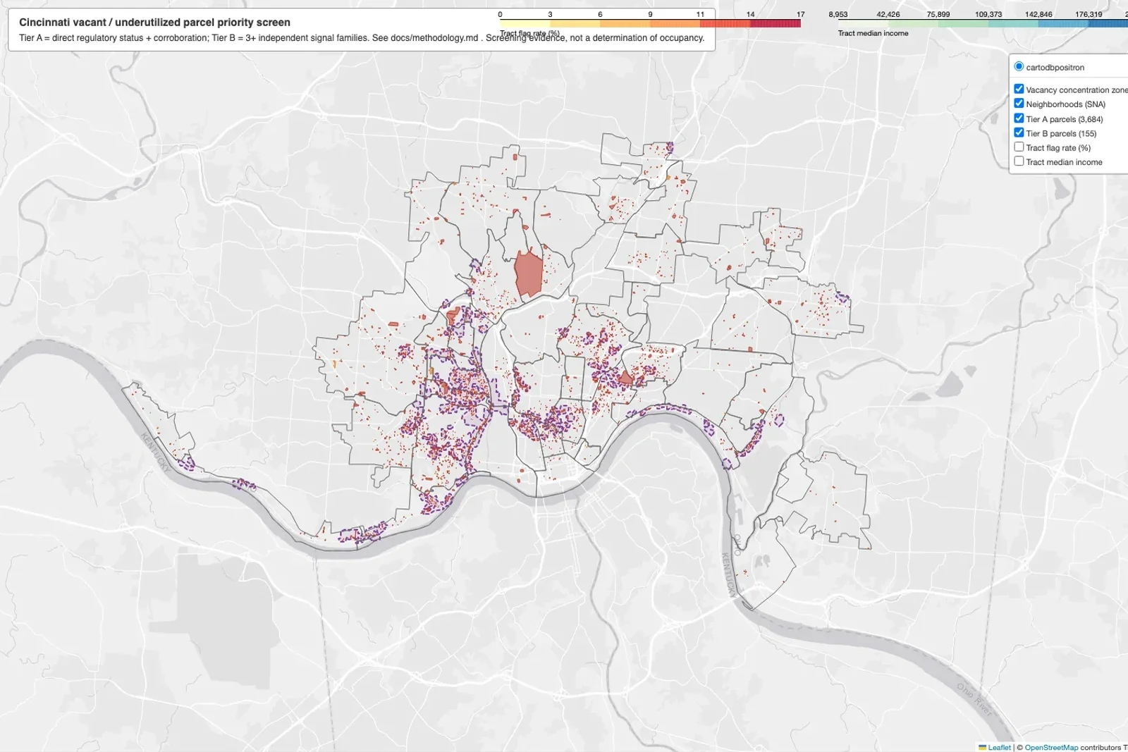
A reproducible screen of all 98,666 taxable parcels in Cincinnati that flags 3,839 as vacant or underutilized priority candidates and groups them into 56 concentration zones.
- Role
- Solo. Research design, data pipeline, scoring, spatial statistics, validation, and the interactive map
- Timeframe
- Summer 2026 · About two weeks
- Location
- Cincinnati, Ohio
- Tools
- Python
- GeoPandas
- PySAL
- Folium
- CAGIS
- Census ACS
- Claude Code
The question
Which parcels in Cincinnati are most likely vacant or underused, and where do they cluster? A land bank or community development office needs that answer before it can decide where to send inspectors or focus acquisition. No single dataset says “vacant.” The information is spread across the county auditor, the city’s code enforcement systems, 311, and the census, and each source has gaps.
Approach
The programs I read about (St. Louis, Philadelphia, the Genesee County Land Bank, and Ohio’s abandonment statutes) share one rule: none of them calls a parcel vacant on a single signal. The screen follows that rule. It uses four independent signal families and only flags a parcel when they agree.
- Fiscal distress. Delinquent taxes, with the two year in rem foreclosure standard from Ohio law as the “strong” threshold.
- Valuation and underutilization. Vacant land classes, improved parcels with no building record, and very low improvement to land ratios.
- Regulatory vacancy status. Condemnation orders, barricade and demolition cases, vacant building licenses, and vacancy registrations from the city’s open data.
- Complaints and activity. Parcel keyed 311 vacancy reports, repeat building violations, and enforced lot abatements, with recent permits and homestead exemptions as counter signals.
Parcels are scored by concurrence into evidence tiers, with no invented weights. Then a Local Moran’s I pass finds where high scoring parcels sit next to each other, since clusters, not single lots, are what a program would act on. The pipeline is eight numbered scripts that download, build, score, cluster, validate, and map, so the analysis can be rerun from scratch. I built it with Claude Code as a pair programmer and wrote up every threshold and its precedent in a methodology document.
What it found
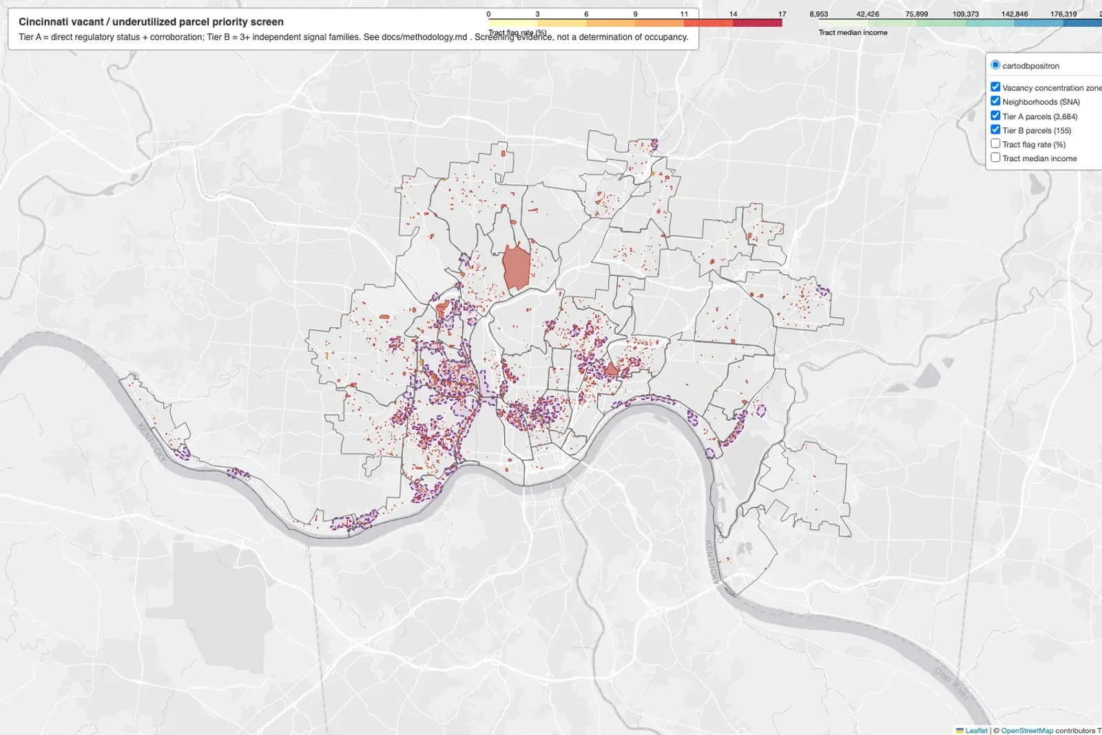
Of 98,666 score eligible parcels, the screen flags 3,839 (3.9 percent) as priority candidates: 3,684 in Tier A (a regulatory case corroborated by at least one other family) and 155 in Tier B (three or more families agreeing without a regulatory case, almost all delinquent lots the city keeps mowing). Another 7,668 sit on a watch list.
The flags cluster strongly (global Moran’s I of 0.31) into 56 concentration zones that match the city’s known disinvestment corridors: a west side crescent through North Fairmount, the Price Hills, and East Westwood, plus pockets in the West End and Mt. Auburn. South Fairmount has the highest flag rate of any neighborhood at 16.9 percent of all parcels.
How much to trust it
I checked 40 parcels against aerial and street imagery and recorded the misses. About three of four Tier A flags visibly check out, 15 of 15 Tier B flags are vacant land, and there were no false negatives among 10 control parcels. All three Tier A misses were properties whose regulatory cases were old or resolved and that now look actively used. That is the model’s weak point: the five year lookback keeps closed cases alive.
Two caveats apply to every number. Exterior imagery cannot see inside a building, and a confirmed vacant hillside woodlot is not a redevelopment site. Several Tier B parcels are candidates for greening or side lot programs, not construction.
Equity overlay
Flags concentrate in the lowest income tracts (about 8 percent of parcels flagged in the bottom income quartile against 1.6 percent in the top) and in tracts that are 50 to 75 percent Black. These are descriptive correlations. They show where the flags land, not why, and the methodology lists what the tool should not be used to decide.